
When colors match the theme of baby products, it creates better visual harmony and makes the brand stand out in those custom gift boxes. According to some research from last year, around 78% of people link consistent color schemes with professional quality when it comes to baby stuff. Take soft yellows for example they really work well with woodland themed items because they feel so natural. Mint green is another good choice that looks great with modern nursery setups. These color choices matter a lot for creating that special connection between parents and their babies' products.
| Theme Category | Color Examples | Use Case |
|---|---|---|
| Gender-Specific | Powder blue, blush pink | Christening or gender-reveal gifts |
| Nursery-Inspired | Lavender, peach, cream | Matching crib sheets or mobiles |
| Seasonal | Pastels (spring), berry red (winter) | Holiday-themed baby shower boxes |
Market trends reveal a 40% growth in demand for culturally resonant designs since 2022, with lunar new year-themed boxes using red/gold combinations outperforming neutral palettes by 31% in Asian markets. Sustainable themes featuring organic-material colors like unbleached cotton white now account for 27% of premium baby gift box sales.
Pastel blues and greens are associated with calmness by 72% of parents, making them ideal for bedtime-themed gift boxes. Soft lavender and mint green reduce perceived stress levels by 23% compared to brighter shades (Trendsi, 2023), aligning with caregiver priorities for tranquil nursery environments.
While soft pink remains popular for gender-specific themes, lavender’s balance of warmth and coolness makes it universally appealing for promoting relaxation. Mint green, linked to renewal and safety, is increasingly used in unisex packaging to move beyond traditional gendered associations.
Warm peach tones elicit 18% higher happiness responses in caregivers than stark whites, while aqua supports creativity in developmental toy packaging. Gray provides a neutral base that pairs effectively with pops of yellow—a color shown to boost mood by 34% in infant care settings.
Leading brands now emphasize emotional resonance over gendered assumptions, with 61% of millennial parents preferring earthy terracotta or creamy white packaging. As noted in psychology-driven design analyses, this shift reflects broader cultural demand for inclusive, theme-driven color stories rather than binary pink/blue paradigms.
More than half of parents these days seem to be going for gender neutral stuff when picking out baby products, according to some recent market research from Market.us in their 2024 survey. We're seeing this same thinking applied to those custom gift boxes too. Earthy colors and nature themes are really catching on with families who want to move away from the old pink and blue divide. Stores have noticed something interesting happening too. Their data shows around two thirds more people interacting with products that don't scream boy or girl. Makes sense really, since most parents want things they can actually use again for another kid down the road instead of buying new stuff every time.
These four palette strategies balance neutrality with warmth:
A 2024 packaging study found earth-toned gift boxes increased perceived product value by 33% compared to pastel alternatives.
One major baby products company saw their sales jump by nearly a third during the first quarter of this year after they ditched traditional gender-specific packaging for earthy terracotta and sage colored gift boxes instead. Their new design included those clever reversible ribbons that work with almost any nursery decor style, plus personalized monogram options available in three different neutral metal tones. They even added handy QR codes on each box that connect parents to online tools for matching colors with existing furniture. The changes helped cut down on warehouse expenses by around 18 percent because they could streamline their stock keeping units. Customers loved it too, giving the products an average rating of 4.8 out of 5 stars from all sorts of different buyers.
When it comes to customized gift boxes, color choices really matter during different seasons. Springtime often sees light pastel shades taking over design boards these days. Think mint greens and those gentle peach tones that somehow remind everyone of fresh flowers starting to bloom again after winter. Come fall though, people start gravitating toward warmer colors like terracotta and golden yellows mixed with some burnt orange accents. These hues just scream autumn coziness if you ask me. Winter brings out the cool side of things too with icy blues and frosty white packages becoming super popular around December time. The Avery 2024 Seasonal Packaging Report actually backs this up showing that about 62 percent of shoppers look for wrapping that fits whatever season is happening when they shop. So getting those colors right isn't just nice to have but pretty much essential for anyone running holiday promotions or special seasonal offers.
Popular themes require distinct palettes:
Parents increasingly seek nursery-themed baby products, driving demand for gift boxes that complement decor styles like Scandinavian minimalism (soft grays, creams) or bohemian (warm terracotta, sage). Aligning colors with trending nursery palettes ensures gifts feel personalized and harmonious with the recipient's home aesthetic.
Start looking at what colors make up your brand's main palette and see how they fit with what's trending in baby products these days. Think about things like forest inspired designs, starry night themes, or whatever season is hot right now on the market shelves. Grab those Pantone color books or check out online tools to find colors that work well together. We've seen some great results when brands mix gentle pastel tones with warm, natural colors for their baby box collections. This creates that seamless look from the moment someone opens the box all the way through to using the actual products inside. A lot of successful companies actually spend time testing different combinations before finalizing their color schemes.
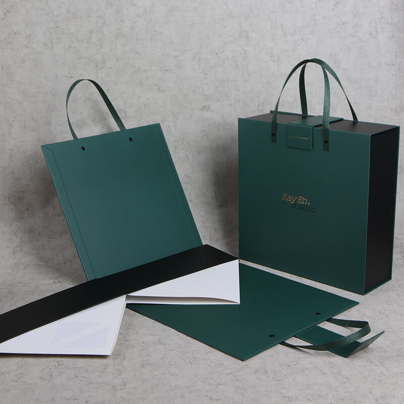
Want to make those custom gift boxes really stand out? Try adding some tactile features such as embroidered monograms or little samples of different fabrics with interesting textures. These physical touches can transform ordinary packaging into something memorable. For businesses looking to streamline their design process, offering digital mockups makes sense too. Clients get to see how various patterns might work together with company logos and color schemes before making any final decisions. According to research into current packaging preferences, around three quarters of shoppers actually favor companies that let them preview products interactively. Why? Because seeing options upfront cuts down on guesswork and generally leads to happier customers who feel more confident about what they're getting.
Using 3D rendering software helps see how colors really look in various lights or when paired with specific decorative themes such as flowers or shapes. Before going all in, it's smart to run some limited print tests just to check if those colors come out right on actual materials, particularly tricky ones like metallic finishes or smooth gradient transitions between shades. Taking this extra precaution saves money down the road by catching issues early. Plus, it makes sure the final product matches exactly what was envisioned for the packaging design and fits nicely within the overall brand image too.
The most popular baby product themes include gender-specific, nursery-inspired, and seasonal themes. Examples of color schemes for these themes are powder blue and blush pink for gender-specific, lavender and peach for nursery-inspired, and pastels for spring or berry red for winter in seasonal themes.
Color psychology in baby product packaging can create calming, cheerful, or soothing effects. Pastel blues and greens are linked with calmness, making them ideal for bedtime-themed gift boxes, while colors like lavender and mint green can reduce stress perception.
Parents are choosing gender-neutral color palettes to move away from traditional pink/blue divides. This approach is driven by a desire for versatile and reusable products that don’t conform to gender stereotypes, and have an appeal that lasts for subsequent children.
Colors like beige, sage, terracotta, and mocha brown are recommended for inclusive baby gift boxes. These tones balance neutrality with warmth and align with market demands for non-gendered and environmentally friendly products.
Nantong Milan Economic and Trade Development Co.,Ltd was founded in 2010.